Congratulations on Suite 8, it’s looking great and the architectural move to Symphony + Angular is very well designed, in the way that it integrates the Legacy code behind it and allows us to progressively move it to the new world.
I wish the feature goals would have been different, some basic features (email, templating) needed more attention than UI, in my humble opinion… but what the heck, this is an immense step forward and I am grateful to SalesAgility for all the investment made in SuiteCRM 8.
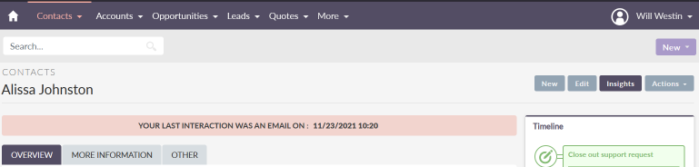
Regarding specific feedback, let me start with just one thing: please improve the use of vertical space. There’s too much unnecessary scrolling going on. Very often one goes into a detail view just to check on a subpanel… and how far below is that? Scroll, scroll, scroll.
Specific possible improvements, which shouldn’t be too difficult to make:
- Remove unnecessary toolbars like “search”, or make them part of other toolbars. Let them scroll off screen instead of keeping them fixed there.
Maybe also move that “Your last interaction” tip thing somewhere else, on the same line as the record title name, perhaps. Or to the sideline.
That “Overview”, “more information”, “other” is terrible UI design, it is either useless or else makes them go fishing for their field over many panels… and too many people who can’t design a database just pile up dozens of fields in panels  . Any way, that’s just a left-over problem from the SugarCRM days. My suggestion (for now) is just to ensure it doesn’t use vertical space (at least optionally).
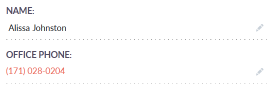
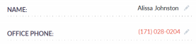
- Make the fields part of the Detail view (at least optionally) show the field label next to the field value, instead of above it.
| Instead of this… |
 |
| — |
| …use this |
 |
| — |
- Allow (at least optionally) this area to be moved under the subpanels.
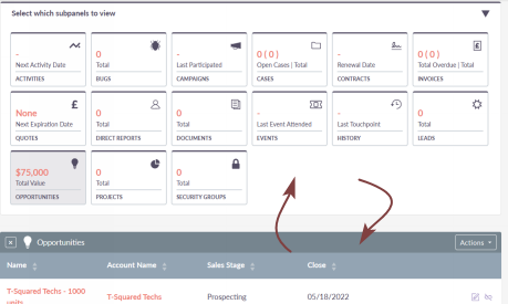
The general purpose of my suggestions is to make the often-critical top subpanel data appear, not on vertical pixel 1650 (!) like now, that’s 3 page down keys, but rather on the initial screen, visible without scrolling.