So I’ve been working with Sugar (SuiteCRM flavor) for over a year now. Granted it was chosen because my client wanted custom function with lowest budget, so, you have to sacrifice some things. I’m am still just baffled how poor the interface design. One glaring example: only two columns of fields in detail/edit view. Most of my clients use 1920x1080 (FHD) displayes on monitors 24" and larger so this appears a a HUGE waste of screen space. I have hacked the view defs to increase columns but the drag and drop Studio layout editor functions erratically(almost makes it useless) after and you have to hand code view def at some point to clean things up.
So I guess I need to learn how to modify the theme to get this looking better. I would guess since SuiteCRM is a special fork, trying to install other Themes not designed for Suite is asking for lots of issues.
Here’s two simple things that are not in the interface that if someone could tell me how to change this would be a good task to start for learning.
First, List view does not have alternating background shading on rows. This is extremely important when using high resolution display and viewing lists with many columns (very wide).
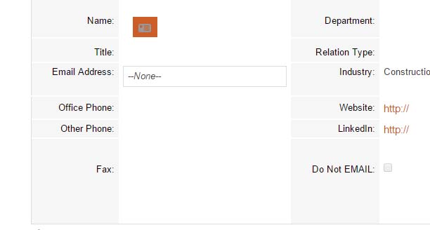
Second, on detail view, again there is no horizontal rule on the rows. Actually it would look best if I could just add a white horizontal rule so it looks like this:
