Hi,
As a newbie i don’t have much to contribute in terms of coding, and really appreciate the efforts made in the functionality and new features added to suite8. However, i cant help think the GUI is being left behind (in terms of design that is) .
For example… the image below shows a typical page on my v7 installation (mobile) and the data (the important bit) is highlighted in blue.
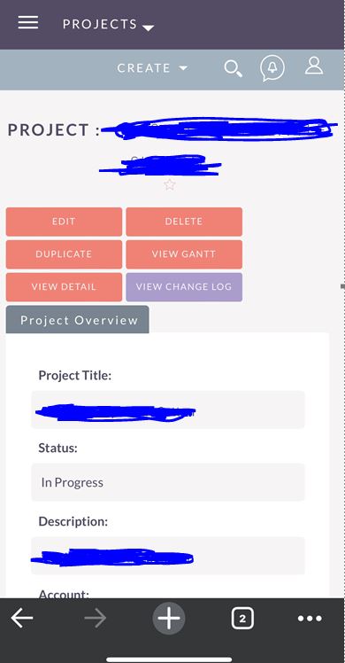
I realise its all subjective and can be changed with overrides etc, but i was really hoping that suite8 would be better out of the box.
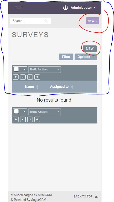
However the image below shows a page from a fresh install. The blue line shows that half the screen is taken up by the navbar, search bar, title, menu and table header. The red line shows two ‘new’ buttons , which i believe is confusing to users, who also can use the main menu.
Who/how, is the gui being planned for future? How do we contribute to the big picture?