Thank you, I’ll work with the media queries to override the bootstrap theme(don’t want to change the core bootstrap files).
Thanks again for the tips and advice. I definitely want to work on this theme for it to be the next generation interface for SuiteCRM, but that depends if the team accept it!
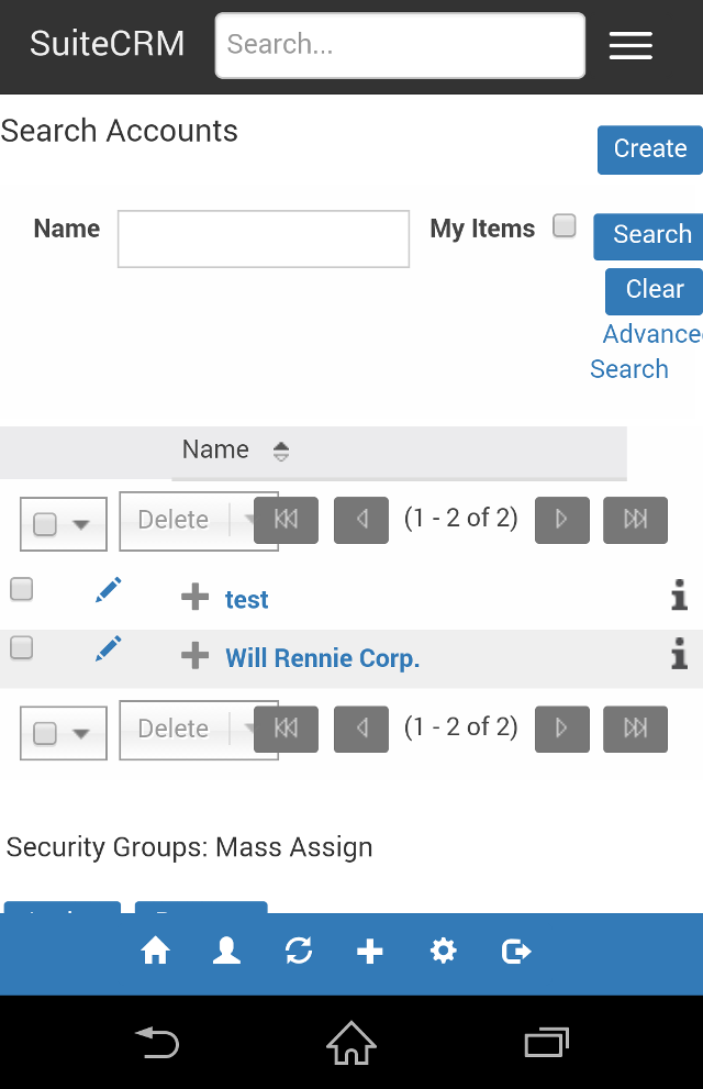
Small update. Added the search bar into the top menu for mobile devices. This means the user doesn’t need to collapse the menu bar and scroll, saving time.
Will, I’ve seen from some of your screen shots that you’re running this on a localhost. For the sake of getting quicker feedback from the community would you be able to put a version somewhere online so others can easily get to it, view it and provide quicker feedback?
Would just like to update for John(Skutter) and all others interested. Utilising media queries, I am optimising the device UI such as the mobile footer. I am also fixing issues with the top menu to work on a variety of resolutions(using inspect elements mobile tools). Over the next couple of weeks, I will be building specific elements and enhancing the top menu, sidebar and other areas dependent on the device.
You will be able to see any progress and fixes on the responsivetheme branch.
Please feel free to contribute any suggestions/constructive criticism, enhancements and bugs to be fixed.
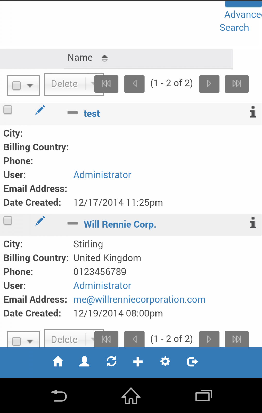
List view is now responsive. The first column in the row in the view is shown, and then the user can expand that row to show all other data/columns for that record/row. This means that the list view records can be easily seen on mobile/tablet devices, and also that no information or data is lost as it can be seen at the touch of a button.
Currently the view looks buggy/cluttered, but we will work on improving this as theme development progresses.
The sidebar has been re-added. This was removed as I wanted to focus on other areas of the theme, fixing bugs and getting customisations stable.
I have fixed many bugs/issues with the sidebar, modifying CSS styles for the entire page area to handle the sidebar on different resolutions to maximise screen area using media queries.
I have also made some slight style changes, mainly adding icons to the recently viewed links so that the user knows which module the records relate to.
I’ll keep you posted on further developments such as sidebar set by user preference(toggle on/off) and much more.
Thanks again to those who contribute ideas and test.
I cannot confirm a completion date as yet. There is still some work to be done improving views to be responsive, and then there is the admin area to tackle(studio etc).
This is looking very good indeed. I’ve had a brief opportunity to test it over a few devices but will look in depth later.
I’m happy to devote testing time across a different devices if required.
Just to add some updates, there have been many bug-fixes lately.
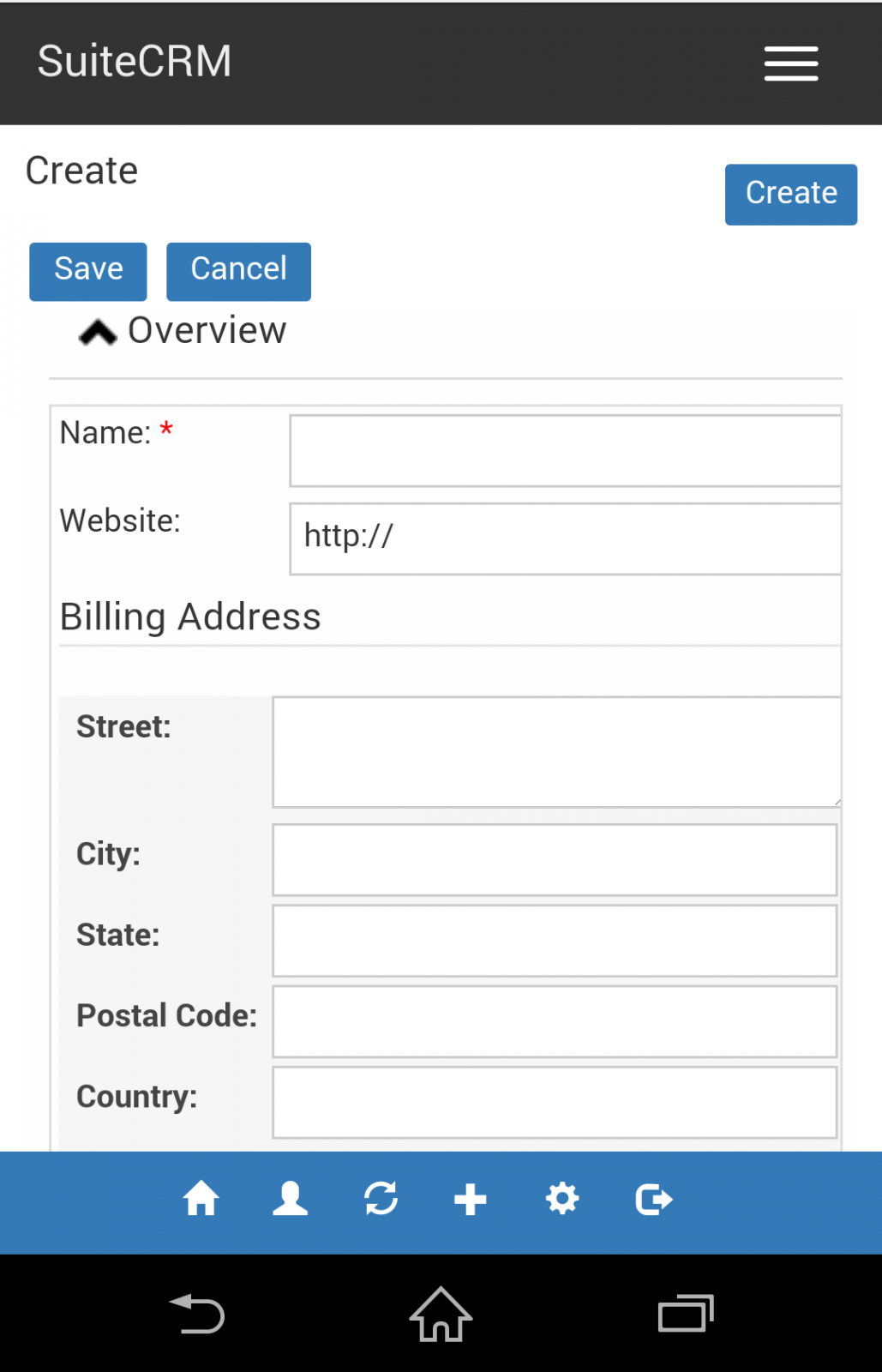
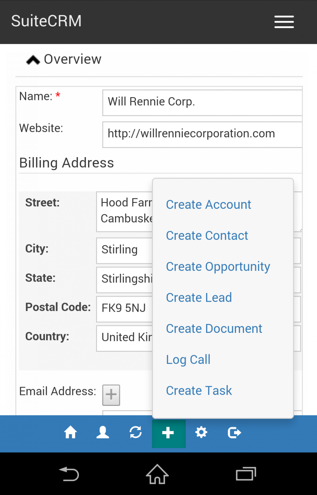
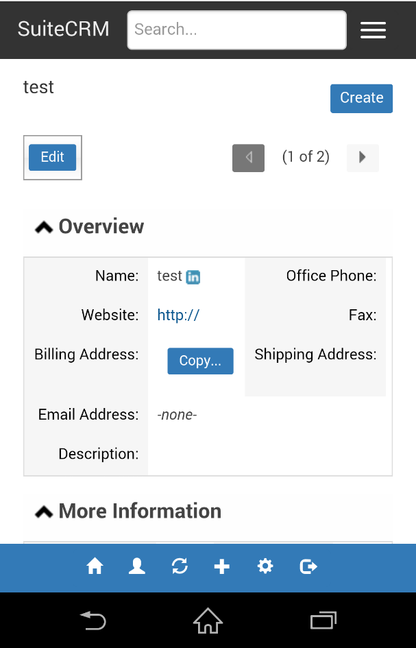
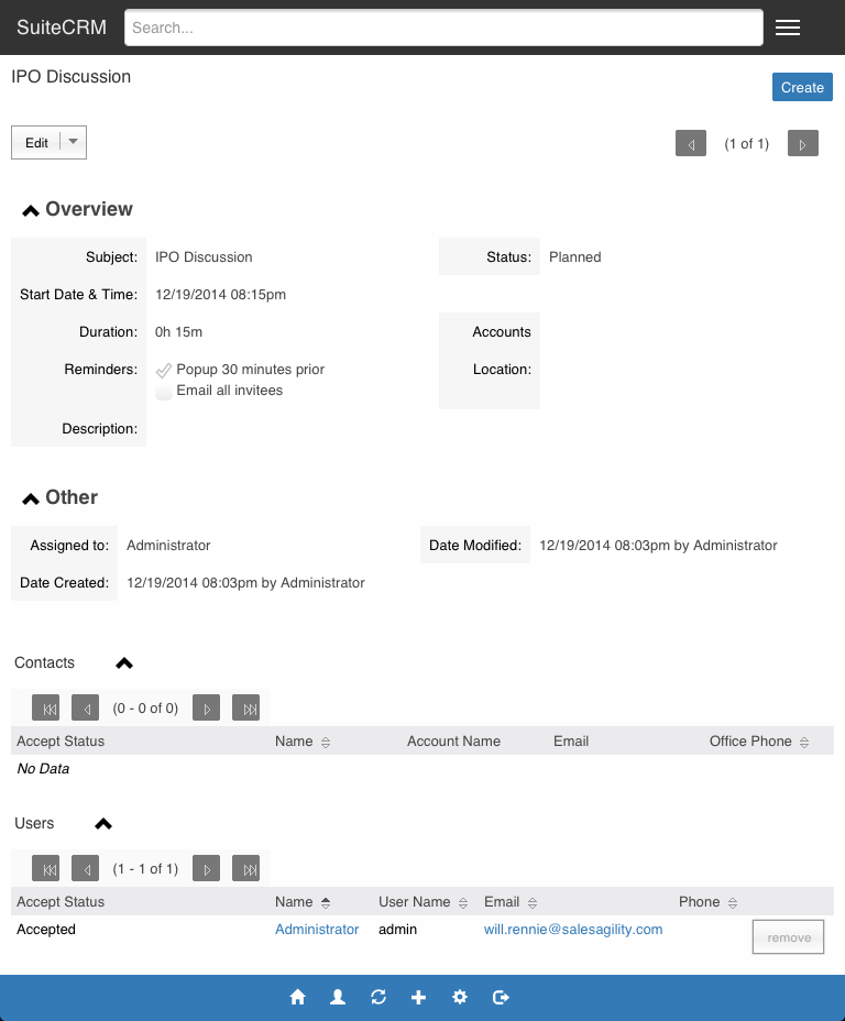
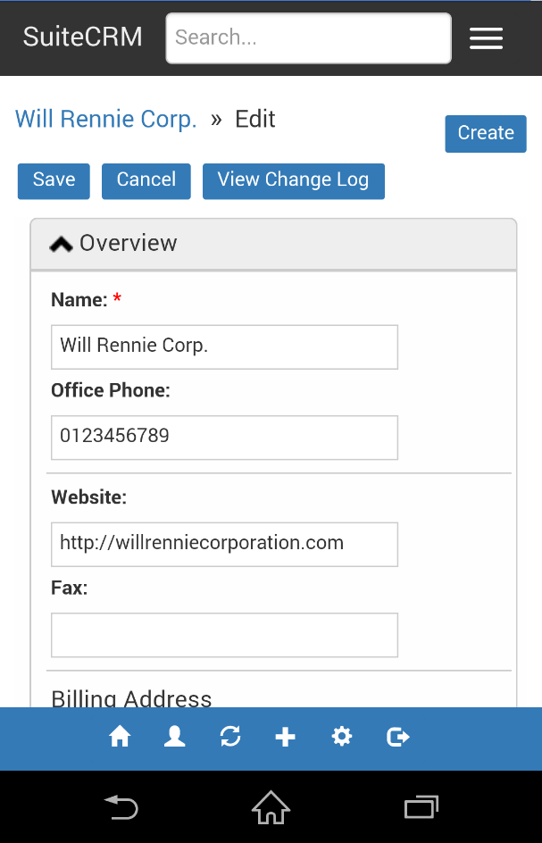
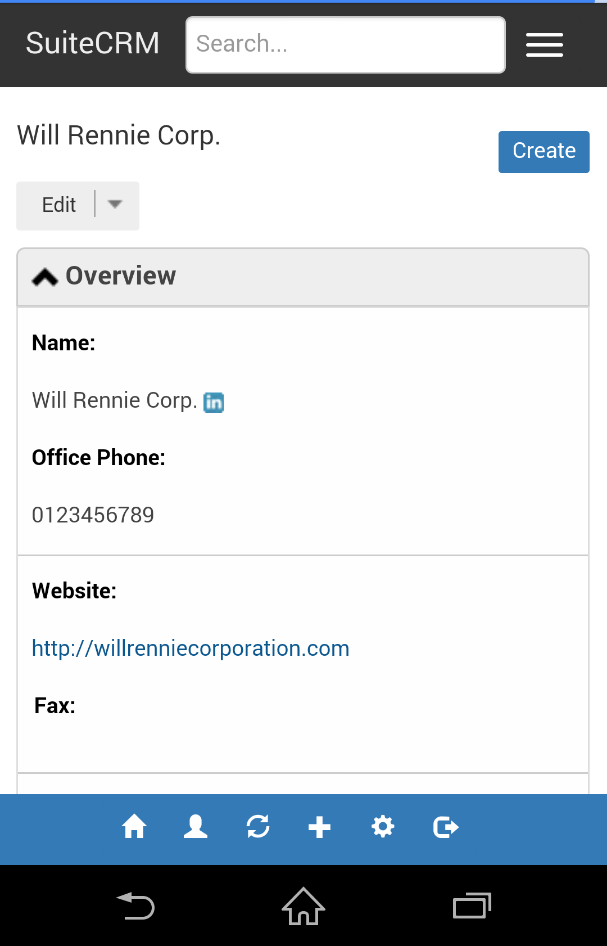
Also, below are some screen shots of responsive detail/edit view.
This means records can be easily viewed/edited from mobile with the ability to expand/collapse sections/panels on the record to view data quickly.
I will continue to work on improving the UI and styling and fixing any bugs.
Sub-panels, pop-ups and dashlets will be the next items to be made responsive, and will keep you updated, as these are the last main items for the user facing side of the theme(not including admin/studio etc.).
great work. You work so tirelessly on the theme - late at night, even holidays are not holy … B)
I have the theme brought to work on our Clone. That was not easy. In order to achieve the same level as the source, it was necessary to overwrite some modules.
htdocs / modules / Administration
htdocs / modules / Users
htdocs / custom / modules / Administration
htdocs / custom / modules / Users
For several years SugarCRM - it can happen that some adjustments in with Costum modules are lost - at least for me.
Maybe this is important if the responsive theme would be integrated into the Upgrade.