Hi Guys
Just a quick question about the reporter and best way to get the graph I need
Using Opportunities as an example
I have 10 opps with different (overall sales stage)
I can write a report that allows me to display all 10 opps and main group the table by overall sales stage dropdown
Using the ID field (I use Opp ID as we have multiple Opps named the same thing)
Using the Overall Sales Stage field
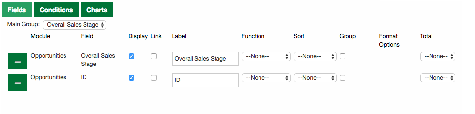
This shows me what I would like to see in the table! How many records in each status - Table result attached

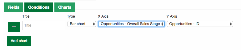
Now, what I seem to have trouble completing is getting a graph to count each record and show against each option in the dropdown
For example
Closed won - 5
Closed Lost - 3
With a chart against each option within the overall sales stage dropdown
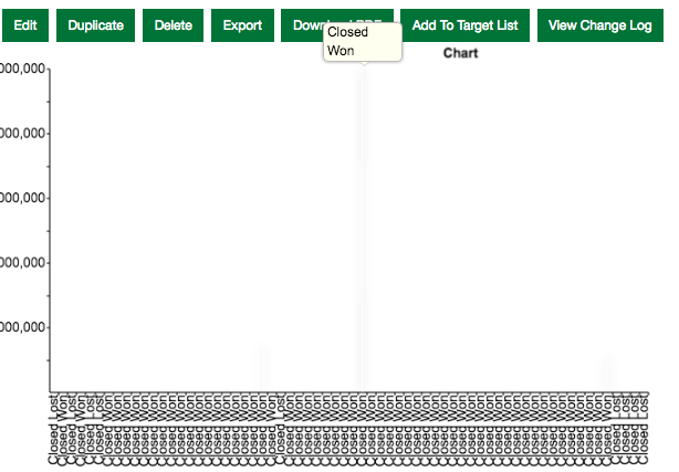
I aim for the chart results to be similar to the homepage Sales pipeline graph that clearly splits the bars by overall sales stage and gives you an accumulated £ amount for each sales stage
Instead of a accumulated financial I just want to see how many their are in each status
Hope someone has some advice
Thanks again
