Hi All,
Is it just me or is the coloring of “split buttons” (not sure if that is what they are called) not consistent in the new Theme?
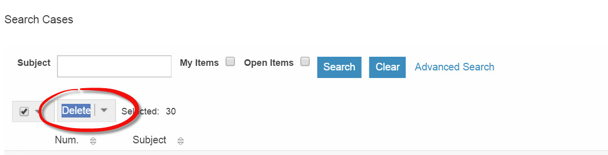
Please see attached Picture.
Note: Although you can not see it, I am actually hovering over the button - hence the reason why the text component of the button is the highlight color.
Shouldn’t the coloring of this button be the same as all other buttons in the system?