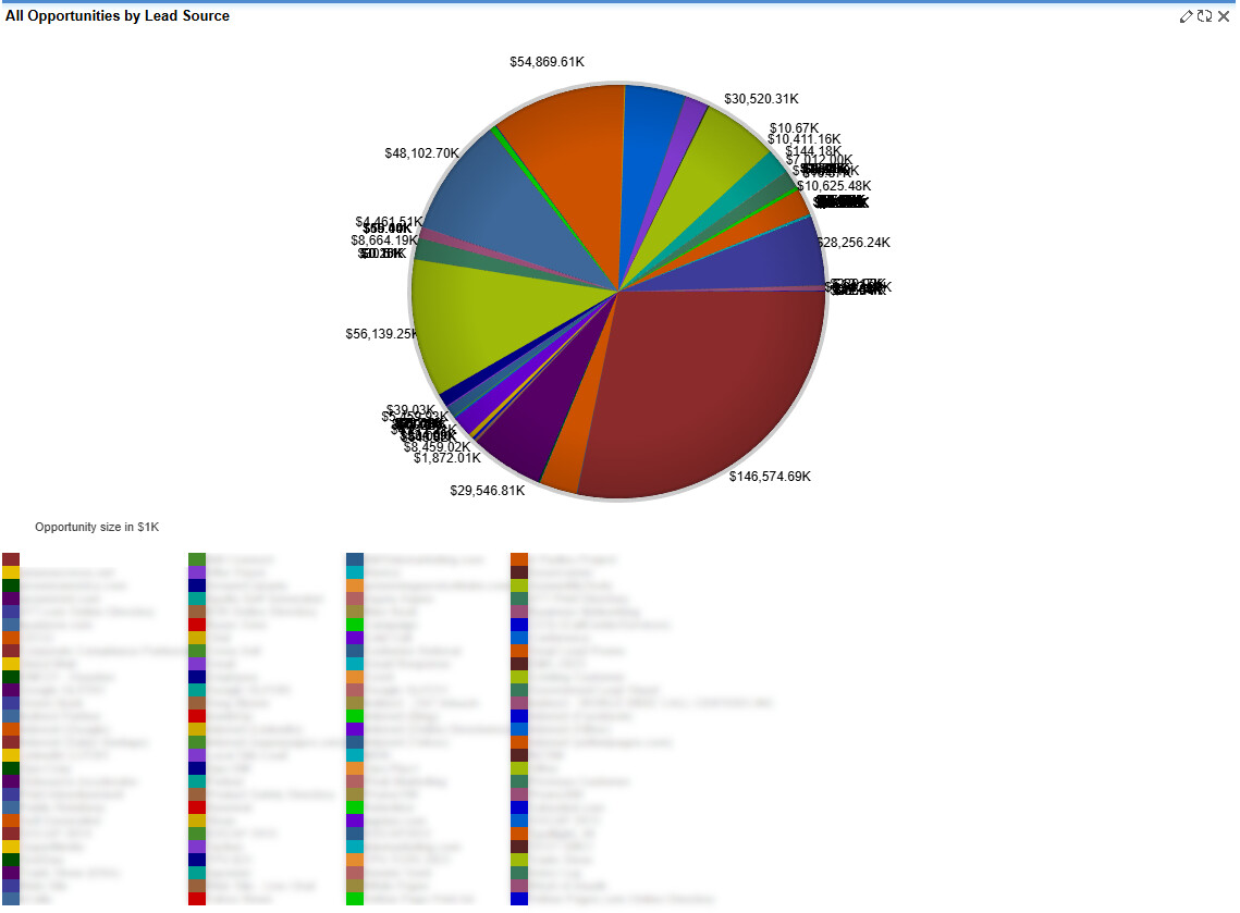
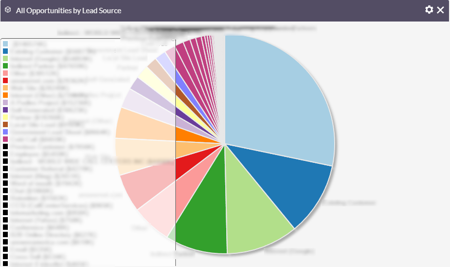
After upgrading from SugarCRM 6.5.25 to SuiteCRM 8.9.1 in a test environment, user tests indicate that the charts that were present and functioning in SugarCRM 6.5 have been truncated into a much smaller space in SuiteCRM 8.9.1, rendering them unusable.
The question is, is there a clean way to allow the charts to expand the dashlets to more appropriately view charts with large datasets?
even on Sugar, I had some issues with reports & charts, depending on how “large” the data sets are.
When staying in the CRM, I often try to report year over year and similar to reduce the amount of data that needs to be loaded.
Even in other CRMs, things can get pretty slow, once there are 0,5 Mio records with a few joins / filters etc.
What I do when reporting requirements are getting more mature and data grows, I use a BI. Either with a CDP / data warehouse or I’d build a model directly in the BI from the Suite tables.
Metabase for instance in incredibly easy to use and quite powerful:
The problem is not the charts as they exist, but simply the size of the canvas they are painted on. The dashlets canvas is too small for these charts and cannot be resized. If I had a way to have a dashlet expand to fit the data like it did in SugarCRM 6.5 that would solve my issue.
You can code a custom Google Chart and lay it out however you want. There are lots of tutorials here about embedding Google Charts into dashlets. That’s essentially what my plugin does, although in a dashlet kind of way rather than an embed an entry point kind of way. If you want a custom chart built you can reach out to me privately.
What you’re experiencing is a known limitation in SuiteCRM 8.x dashboards, particularly noticeable after upgrading from SugarCRM CE. In SuiteCRM v8, dashboard dashlets use a fixed grid layout with constrained height, and chart dashlets do not automatically expand based on the size of the dataset.
You can try the following workarounds to improve usability:
1. Manually resize the dashlet
Edit the dashboard and expand the dashlet across more columns. While this primarily increases width and the height remains limited, it may still improve readability in some cases.
2. Reduce chart complexity
Apply filters such as date ranges or limit the results (for example, top N records). This often makes charts with large datasets more manageable.
3. Use the Reports module
Charts generally render better within the Reports module compared to dashboard dashlets. If this works for your use case, you can also try embedding the report into a dashboard.
4. Custom development (advanced option)
If none of the above approaches meet your requirements, custom development is the remaining option. This would involve CSS and JavaScript changes and requires proper development, testing, and ongoing maintenance, especially for future upgrades.
Silly question, just realising it now, are you using a 1 column or 2 column layout. If you’re using a 2 column layout and it doesn’t fit, just use a 1 column layout and it gives you the whole screen to work with.
I’ve run into similar limitations with SuiteCRM dashboards before. It seems like the issue is less about the chart itself and more about the fixed-size dashlet/container in SuiteCRM 8. The old SugarCRM layouts were definitely more forgiving with large datasets.
A possible workaround might be custom CSS or modifying the dashboard widget height manually, but for long-term usability I’d probably consider either simplifying the dataset shown in the dashboard or using a custom chart implementation. SuiteCRM’s newer chart system also seems to rely heavily on ngx-charts with fairly rigid layout behavior.