Hi,
I’m experiencing some issues with the GUI that are proving to be a barrier to using suitecrm efficiently.
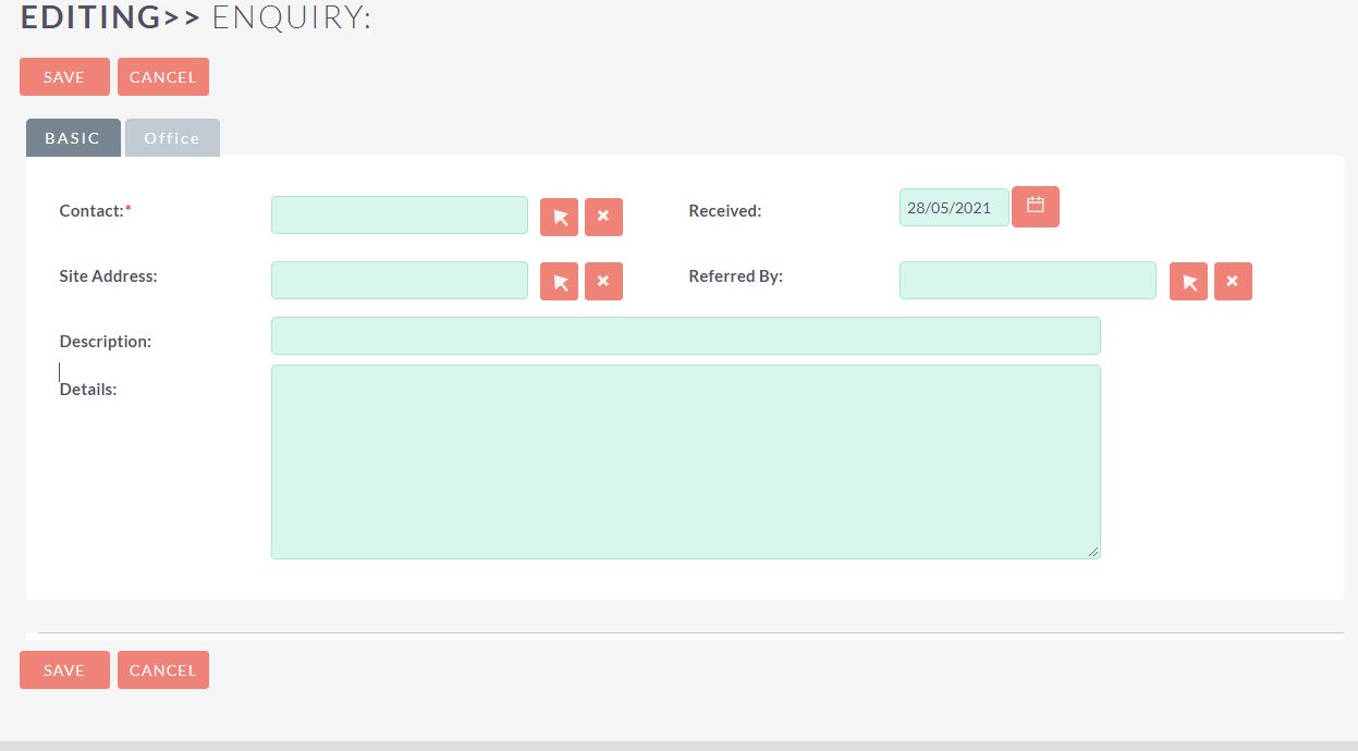
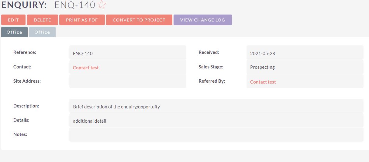
It’s virtually impossible to control the size of fields and columns so that they are easy on the eye. I mainly find this on the edit views. Different field types have different widths and the CSS seems to be all over the place. And yet the detail view is fine… for example, the first image below is the detail view of Opportunities. The fieldnames and fields are presented well with equal widths etc. However the second image shows the EDIT view of opportunities - it looks very different! Why are they treated so differently? This happens across most modules and I think its to do with the field types? e.g. Standard fields react differently to custom fields.
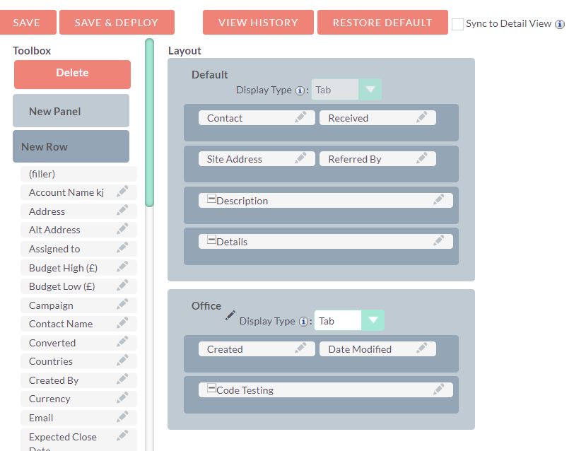
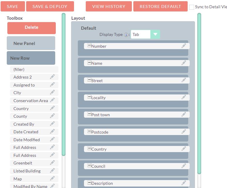
There’s some strange stuff going on in the DIV tags and column spans don’t add up correctly etc.
I even seem to have differences in studio. For example, you can see in the last two images that the field widths are too wide for their backgrounds, but by different amounts.
Not complaining - just desperately trying to get to grips with how the layout/css is working etc.
Is it just me?
Cheers
B